The brief, in short.
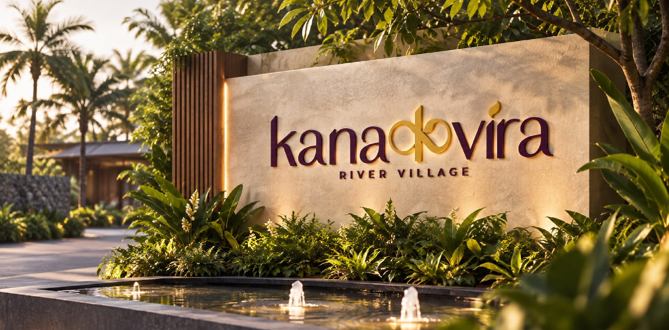
Kanakvira is a riverside luxury resort brand offering nature-immersed stays and premium event hosting — including destination weddings, celebrations, and corporate events. Positioned at the intersection of luxury and nature, Kanakvira needed a brand identity that felt modern, rooted, and unmistakably its own. Sigil Advertising was engaged to design a complete logo identity and brand colour system from the ground up.
- Client
- Kanakvira
- Industry
- Hospitality: riverside resort and events
- Year
- 2026
- Scope
- Four logo directions explored, one developed into a full identity
- Delivered
- Seven deliverables, from the primary logo to editable master files
A Latin wordmark with a Devanagari heart.
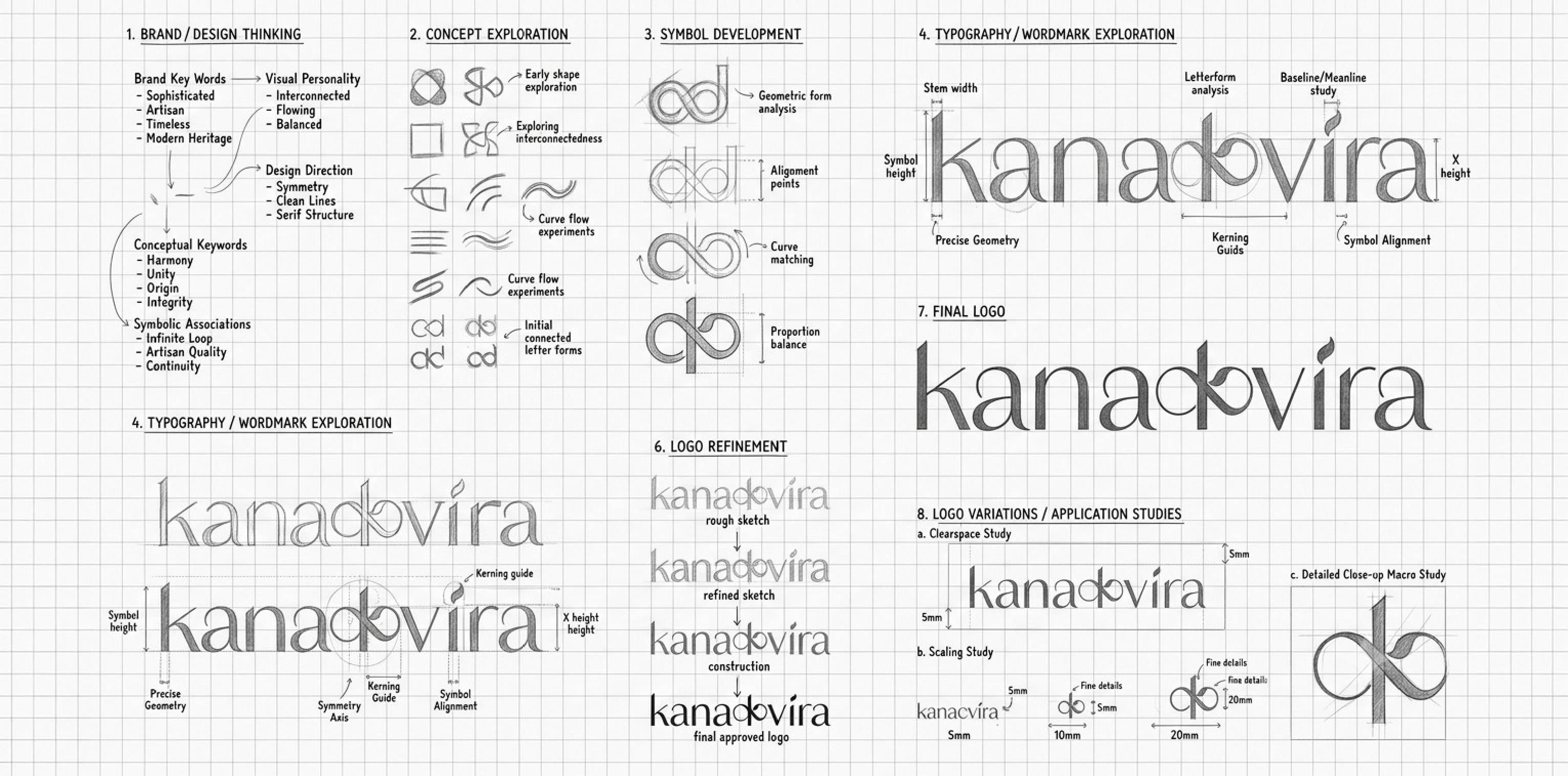
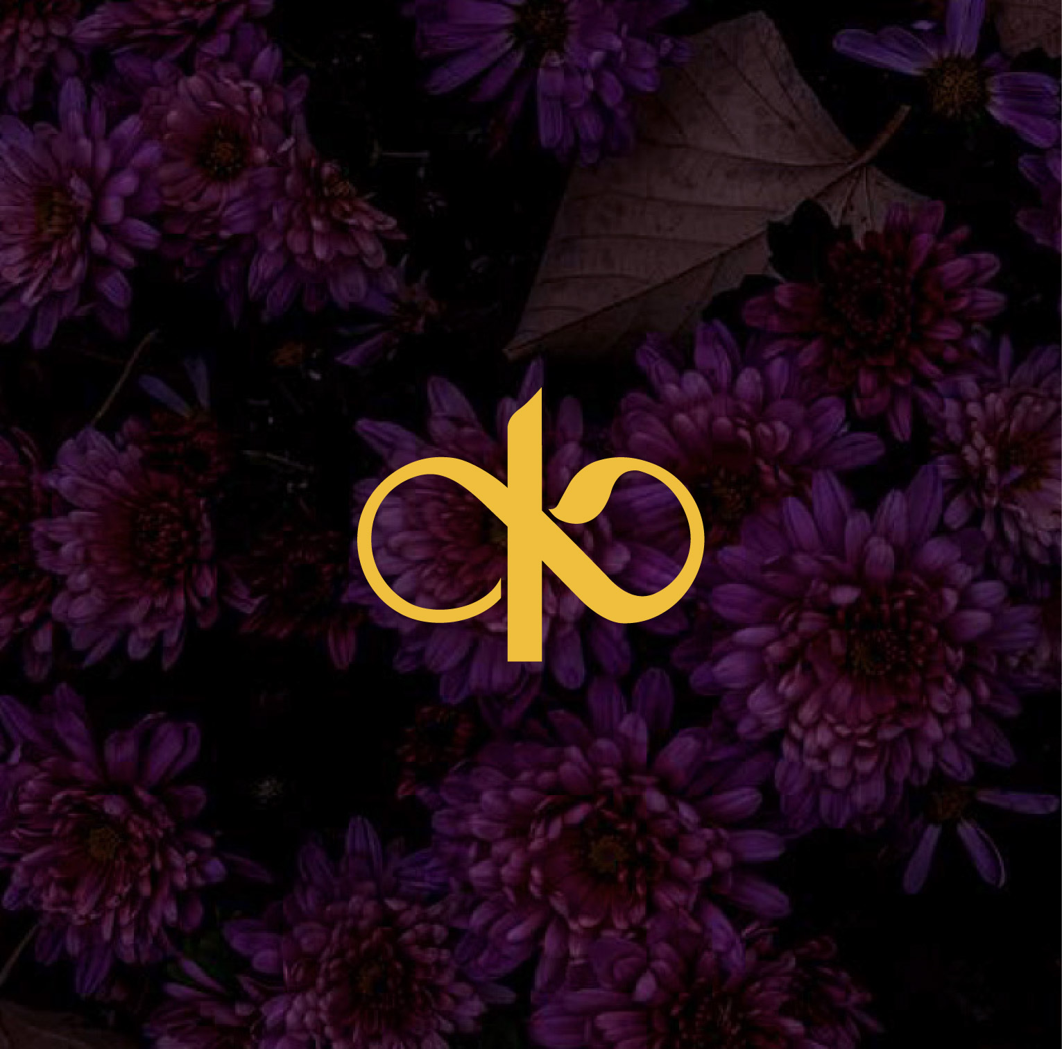
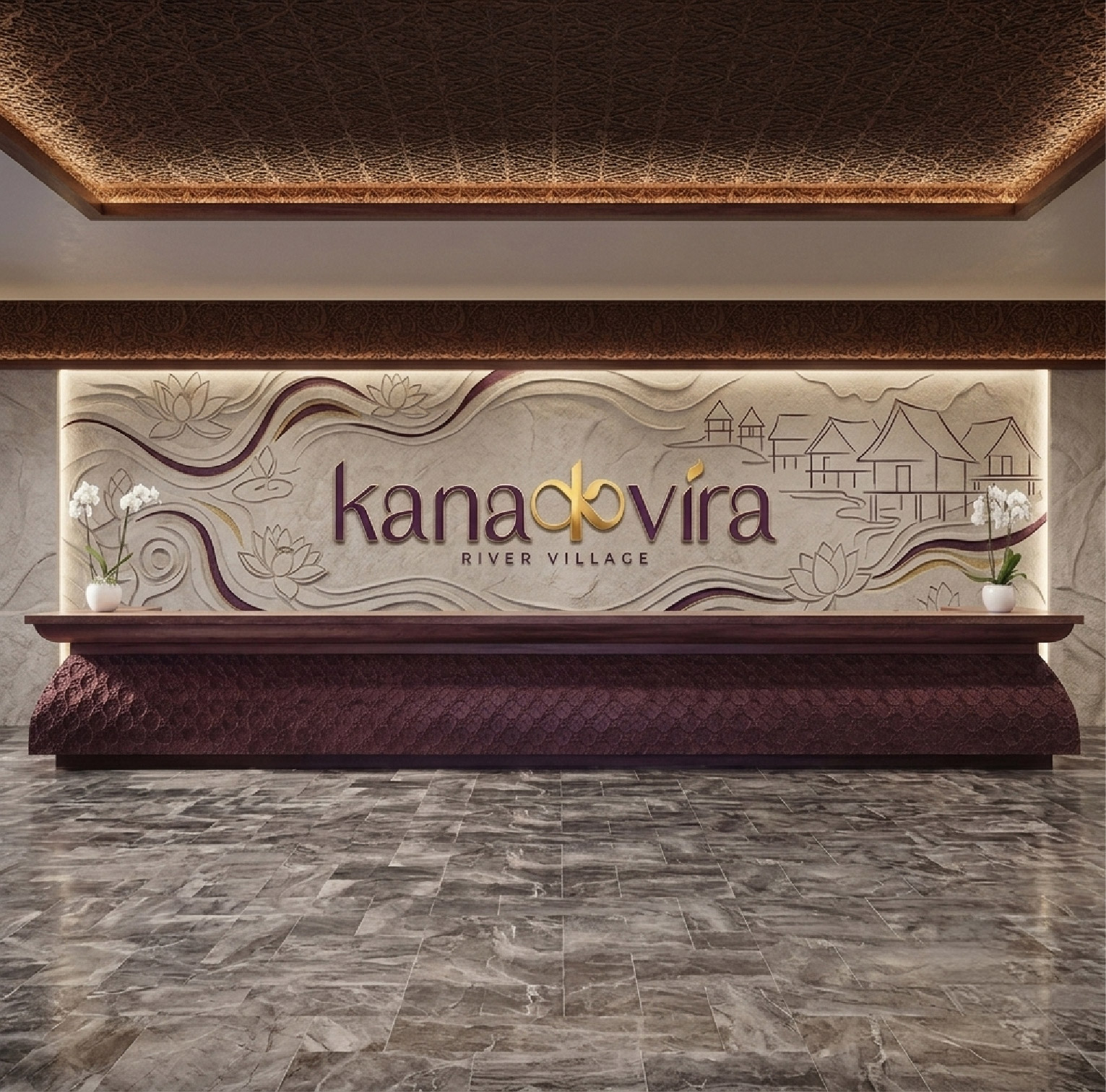
The name Kanakvira splits naturally into two halves — Kana and Vira — with the letter K sitting at the exact centre. Instead of treating this as an ordinary Latin letterform, we replaced it with the Devanagari character क — the very script the name is rooted in — seamlessly bridging the two halves to read kanaकvira. A subtle leaf detail is woven into the क, layering in the natural, riverside quality of the brand on top of its cultural foundation. Four distinct logo directions were explored and presented in black and white before this concept was chosen — rooted in Kanakvira's Marathi origin, original to the brand, and modern in execution without ever dating.
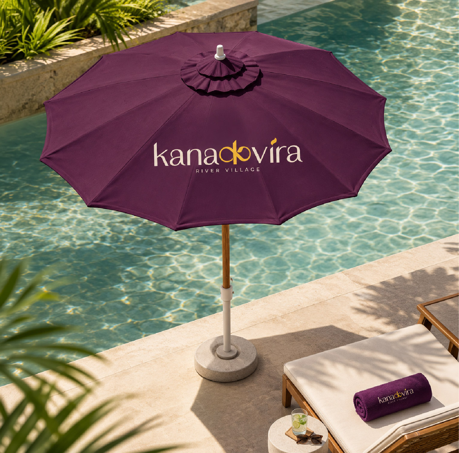
- Primary logo — full colour, black, white, and reversed
- Secondary / icon mark — full colour, black, and white
- Marathi script logo variation
- Vertical (stacked) logo lockup
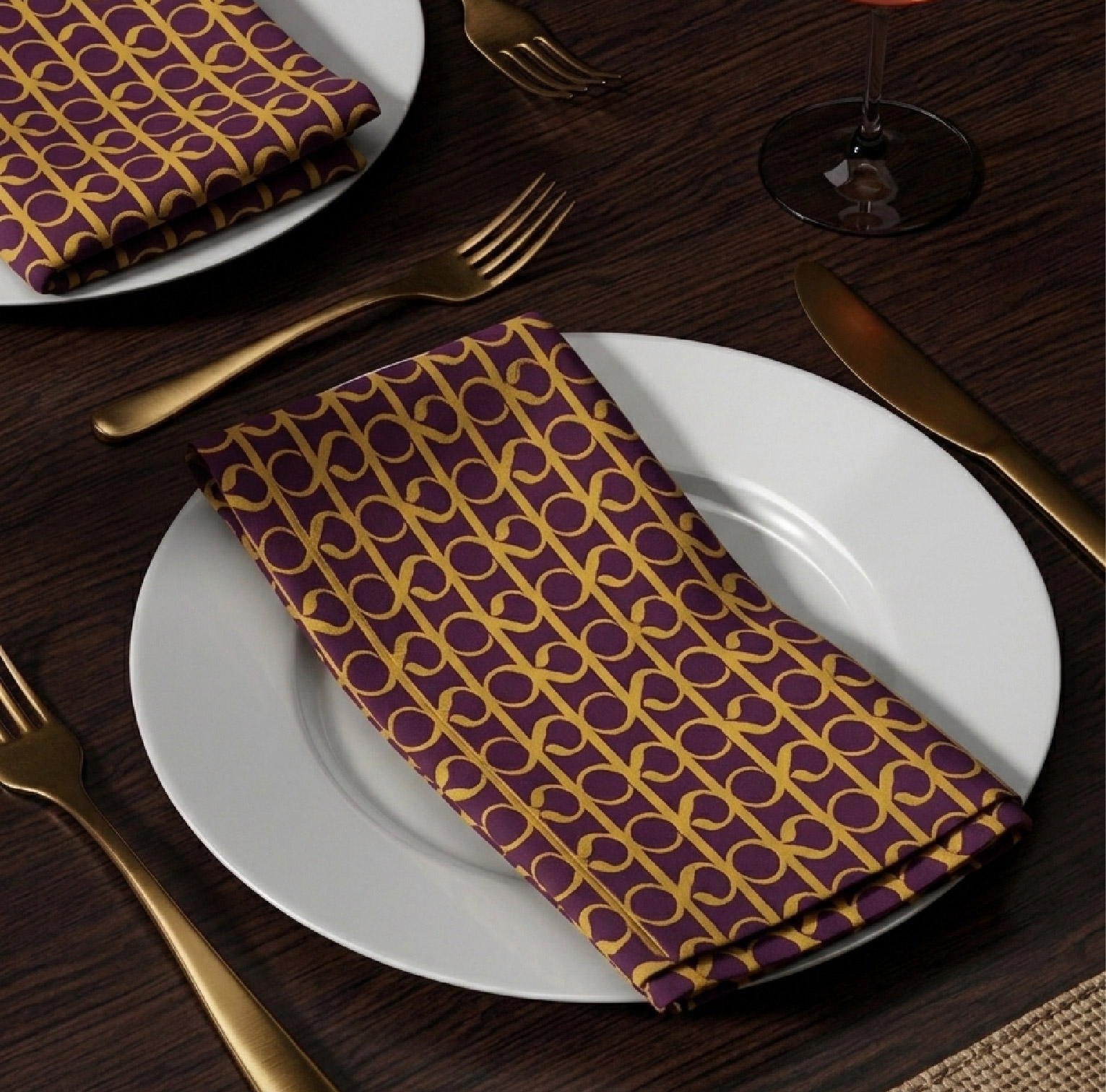
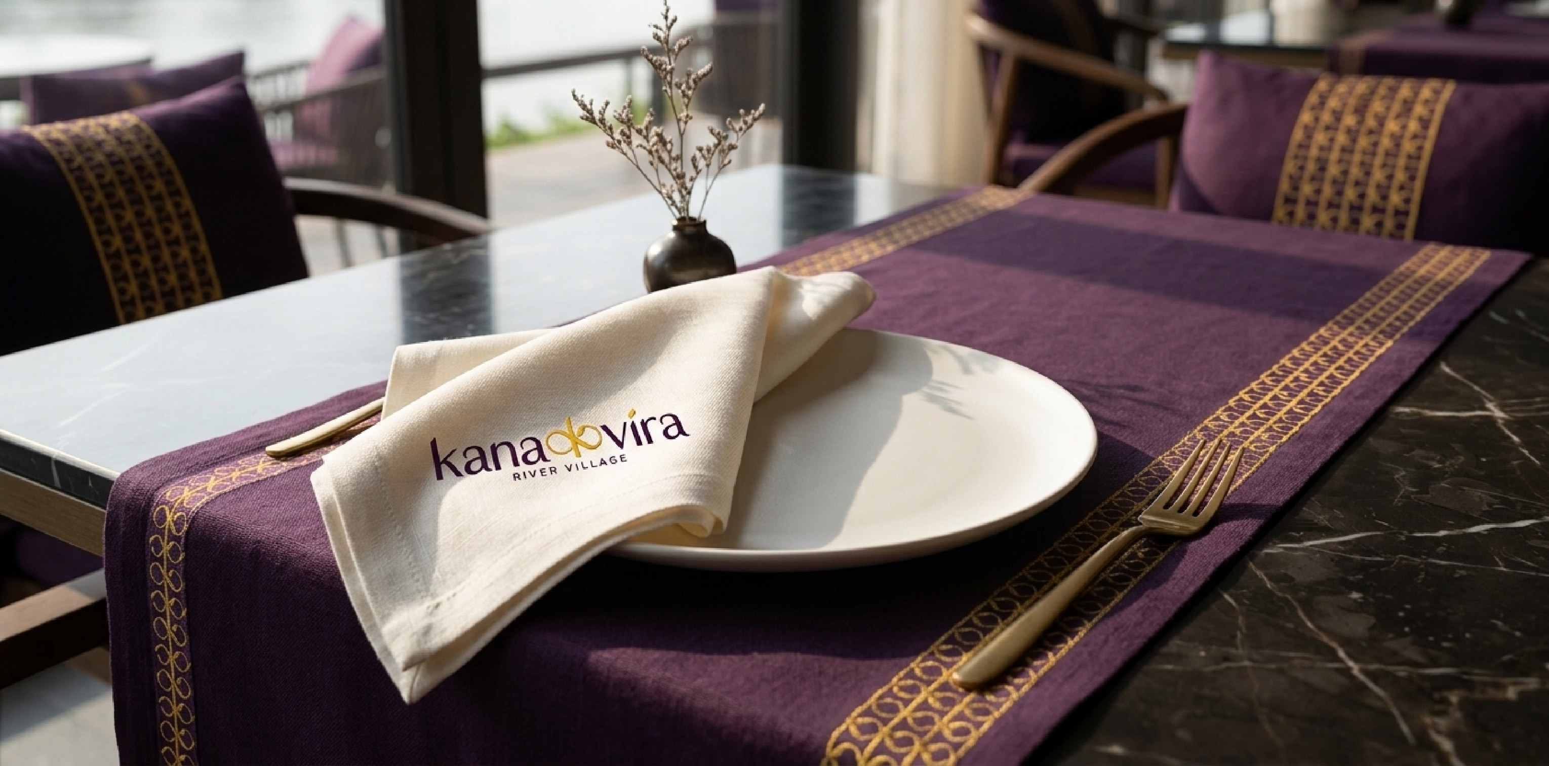
- Brand pattern assets derived from the identity
- Complete brand identity guideline document
- Editable master files and production-ready formats
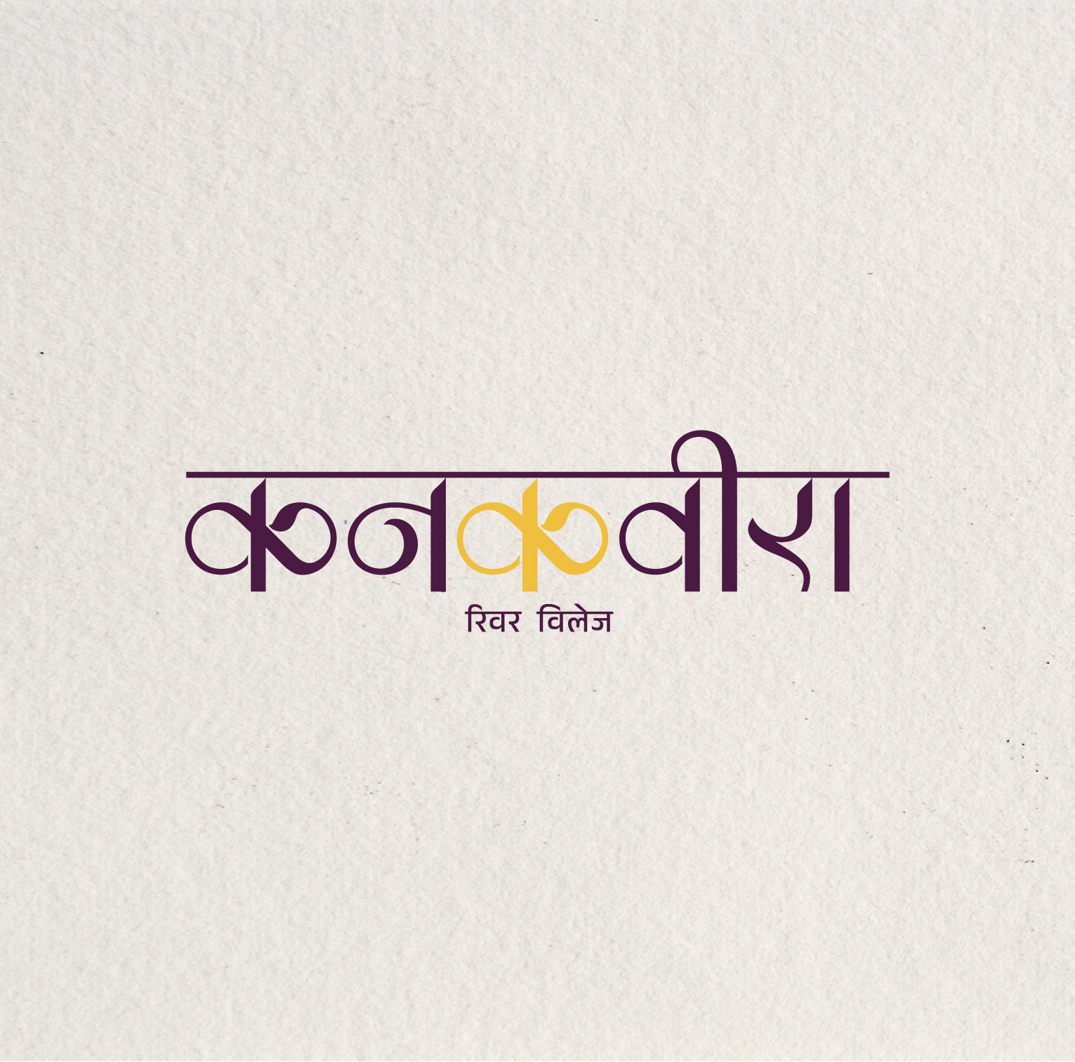
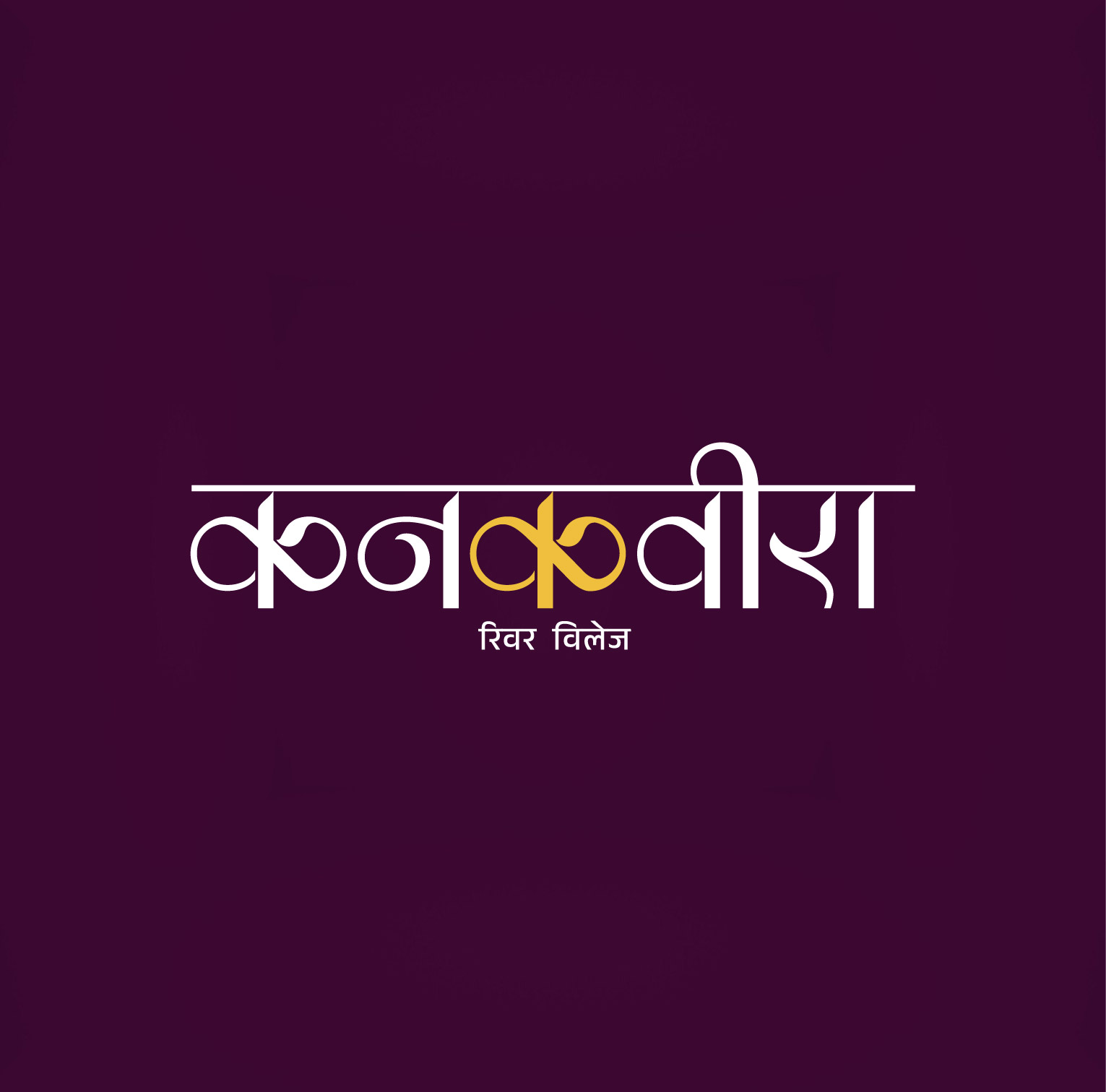
Deep Plum and Golden Yellow — regal, celebratory, unmistakable.
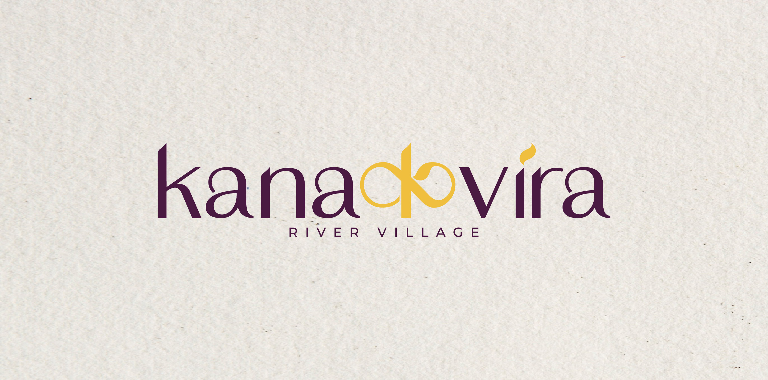
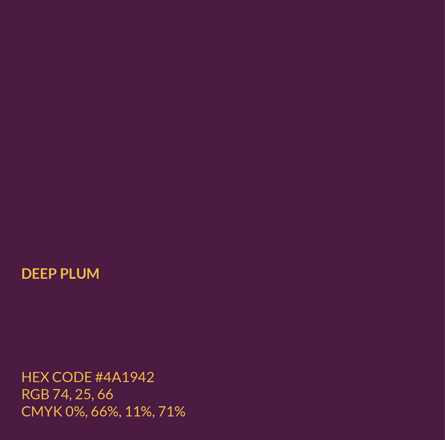
Multiple colour directions were explored with the client — including deep burgundy and golden ochre, royal blue and warm sand gold, and teal and mustard yellow — before the final palette was selected. Deep Plum (#4A1942) is the colour of depth, mystery, and quiet luxury, communicating that Kanakvira is a destination, not just a resort. Golden Yellow (#F0C040) runs through the heart of every Indian celebration — the colour of joy, abundance, and auspicious beginnings — illuminating rather than overpowering. Together, they create an identity equally fitting for a quiet luxury stay and the grandest destination wedding.
- Deep Plum — #4A1942
- Golden Yellow — #F0C040

How a brand identity project runs at Sigil.
The same four steps apply to every identity, from a restaurant to a resort.
Discovery and audit
A brand audit, competitor landscape, audience research and a positioning brief, documented before any visual work begins.
Before designStrategy and direction
Positioning, tone of voice and visual direction boards, so you see the brand language before committing to execution.
Direction boardsIdentity design
The approved direction becomes a full identity system: logo, colour palette, typography and visual language.
2–3 revision roundsGuidelines and delivery
Brand guidelines plus all master files: AI and PDF source files, font files and colour codes.
Master files handed over
Rooted. Modern. Unmistakably Kanakvira.
Kanakvira now has a distinctive, ownable brand identity that tells a story no competing hospitality brand can replicate — a logo rooted in Marathi culture and riverside nature, elevated by a rich, celebratory colour palette designed to resonate with both elite and aspirational audiences seeking a luxury escape from the city.
About this project, answered.
Costs, timelines and files.Last reviewed: October 2026.
The name splits into Kana and Vira with the letter K at the centre. We replaced that K with the Devanagari character क, the script the name is rooted in, so the wordmark reads Latin for guests but carries a Marathi heart. A small leaf detail adds the riverside feel.
Four distinct directions were explored and presented in black and white before the final concept was chosen. It was selected because it is rooted in Kanakvira’s Marathi origin, original to the brand and modern without dating.
Deep Plum (#4A1942) for depth and quiet luxury, and Golden Yellow (#F0C040) for celebration and abundance. Several other directions, including burgundy and ochre, royal blue and sand gold, and teal and mustard, were explored with the client first.
The primary logo in full colour, black, white and reversed, a secondary icon mark, a Marathi script variation, a vertical lockup, brand pattern assets, a complete brand guideline document and editable master files.
Brand identity starts at ₹50,000 for a Brand Starter and ₹75,000 for a full Brand Identity. Multi-brand and hospitality projects are quoted individually after a short brief. Prices exclude GST.
Yes, when it is designed with care. The Devanagari letter in Kanakvira is built into the wordmark so it reads clearly for English-speaking guests while staying rooted in Marathi identity.
Planning a new brand?
Tell us about your venue, your guests and your story. We will send a written quote with scope, timeline and price before any work begins.